
Web Design
Why Your Website Must Work on Mobile First
More than half of all internet traffic comes from mobile phones. If your website is hard to use on a phone, you are losing customers every single day. Here is what mobile-first design means and why it matters for your business.
May 28, 20265 min read
01
Mobile Is Where Your Customers Are
Think about how you use the internet yourself. You are probably reading this on a phone or have already checked your phone several times today. Your customers are no different.
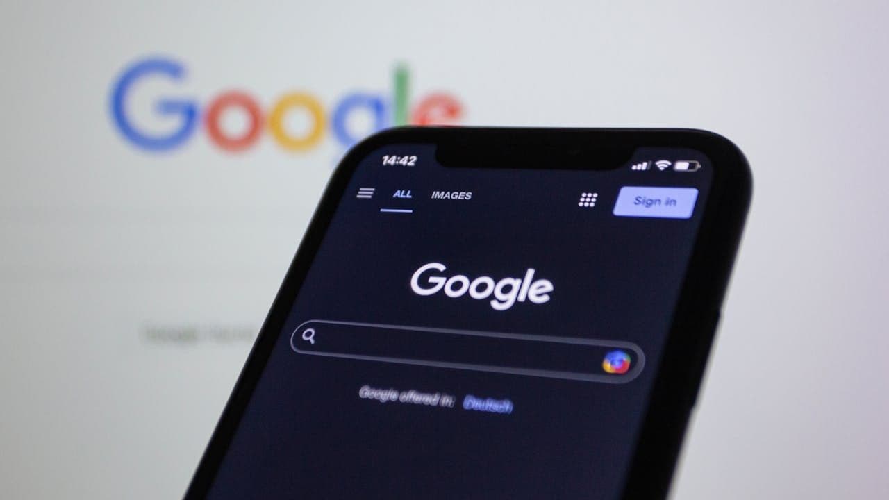
Over 59% of all internet traffic worldwide now comes from mobile devices. That number keeps growing every year. If your website was designed primarily for desktop computers, you are already behind — and you are likely frustrating more than half of your visitors without realizing it.
Mobile-first design means building your website with the phone experience as the priority — not as an afterthought. It means the layout, the text size, the buttons, the loading speed, and the navigation are all optimized for someone holding a phone in their hand. Everything else adapts from there.
02
A Better Mobile Experience Means More Time on Your Site
When someone visits a website on their phone and has to zoom in to read the text, or accidentally taps the wrong button because it is too small, or waits more than a few seconds for the page to load — they leave. And they usually do not come back.
A properly designed mobile website removes all of those obstacles. Text is readable without zooming. Buttons are large enough to tap comfortably with a finger. The navigation is simple and intuitive. Pages load fast. Content is organized so the most important information comes first, without distractions.
The result is that visitors stay longer, explore more pages, and are far more likely to take action: call you, fill in a form, or make a purchase.
03
Google Ranks Mobile-Friendly Sites Higher
Google made a major decision back in 2015: it started using mobile-friendliness as a ranking factor. That means websites that work well on phones rank higher in search results than those that do not.
Since then, Google has gone even further. It now uses what is called "mobile-first indexing," which means when Google's systems crawl and rank your website, they look at the mobile version first. Your desktop version comes second.
In practical terms: if your mobile website is slow, hard to use, or missing key content, Google will rank you lower — even if your desktop site is perfect. A mobile-first website is not just better for your visitors. It is essential for being found online.
04
Mobile-First Design Leads to More Sales
The connection between mobile experience and revenue is direct and measurable.
Research shows that 74% of users return to mobile-friendly websites. Meanwhile, 67% of mobile users say they are more likely to buy from a website that is well-adapted for their phone. These are not small percentages — they represent the majority of your potential customers.
On the other side: 32% of users abandon a website that takes more than three seconds to load. If your website is slow on mobile, a third of your visitors are gone before they have even seen your homepage.
A fast, easy-to-use mobile website removes the friction between a visitor and a sale. Every second you shave off loading time, and every tap you make easier, moves someone closer to becoming a customer.
05
What a Good Mobile Website Actually Looks Like
You do not need to be a web designer to spot the difference. Here is what separates a good mobile website from a frustrating one:
Text is large enough to read without zooming. There is nothing more frustrating on a phone than squinting at tiny text.
Buttons and links are big enough to tap comfortably. Fingers are much wider than a mouse cursor. Small buttons cause mistakes and frustration.
The most important information comes first. On a small screen, space is limited. A good mobile website shows what matters immediately — what you do, who you serve, and how to contact you.
It loads fast. Heavy images and unnecessary animations slow things down. A mobile-first website is lean and efficient.
If your current website fails any of these checks on a phone, it is worth having a conversation about fixing it. The cost of a bad mobile experience is not a one-time problem — it is customers you are losing every single day.
Insights